Suijin Beauty Spa
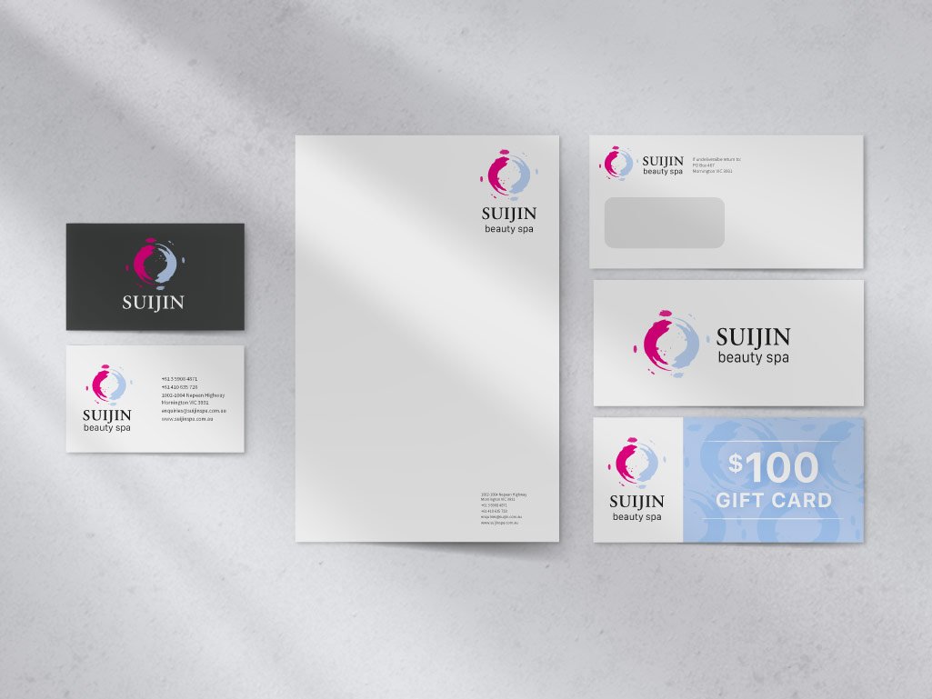
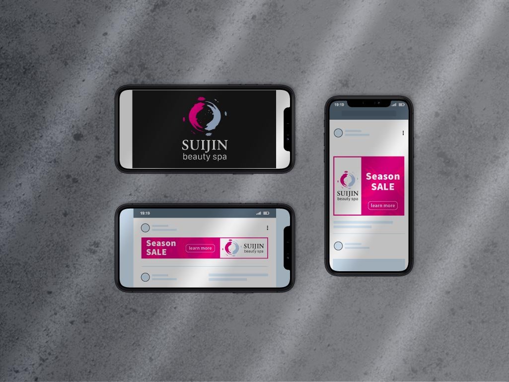
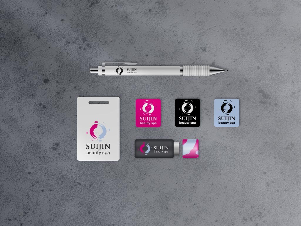
The design brief for Suijin consisted of several linked projects, beginning with logo, then stationery, moving onto digital advertising and finally packaging.
Using the spa name’s origin as the starting point, our purpose was to create an identity inspired by Suijin, the benevolent Japanese god of water.
The logo icon’s round shape and softly splattered brush stroke was created to symbolise the fluidity of water; and its colours were chosen to represent the spa’s treatment options – bright magenta for invigoration and pastel blue for relaxation. For the logo type, a classic serif font was chosen to incorporate the spa’s style mix of traditional and contemporary.
For the stationery, digital and packaging designs, we composed a clean, structured backdrop to showcase the spa’s new decorative style.